
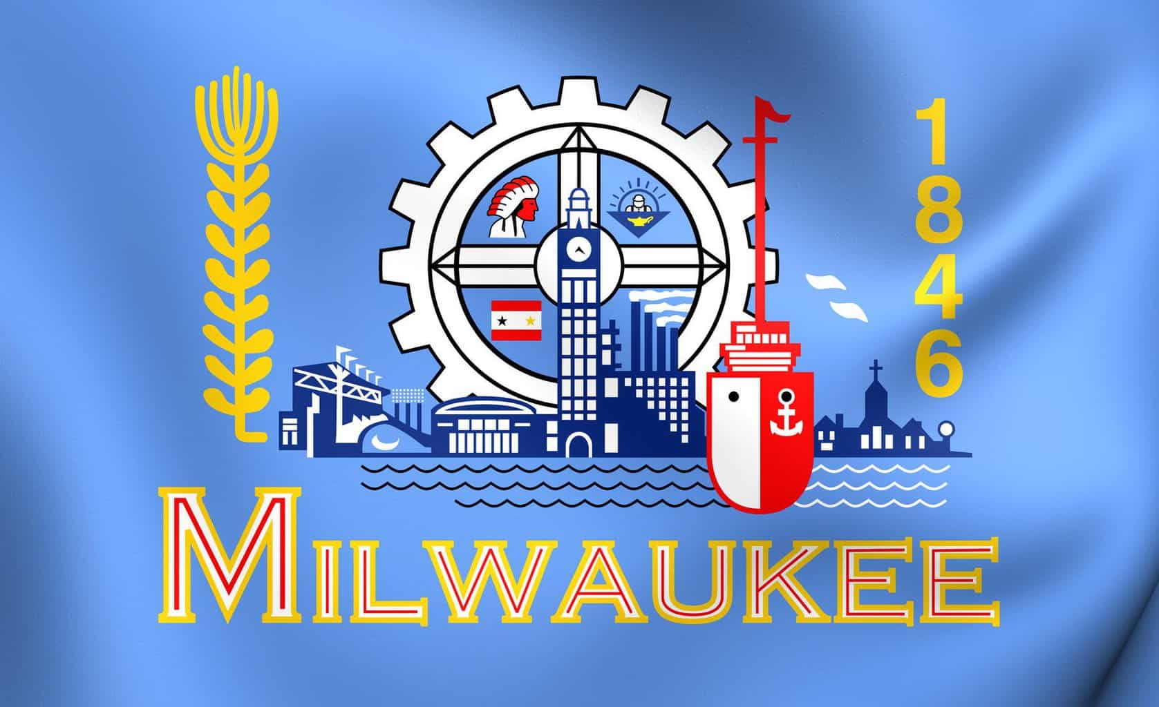
Did you know that Milwaukee has a city flag? It’s one of the busiest flags around, featuring a barley stalk, a large gear, an Indian, an elongated boat with a towering mast, the date 1846, a factory, and more. And is that the Polish Moon in the center of the gear, or City Hall? See the flag for yourself below.
Recently, Milwaukee’s flying standard—which doesn’t seem to fly too often—has become the object of contemptuous criticism. Designer Roman Mars panned the flag in a much-watched youtube video. And the North American Vexillological Association ranked it amongst the 5 worst city flags. Some residents of the Cream City are ashamed of their city colors. Perhaps the flag should be discarded. Perhaps Milwaukee needs a new flag. Such are the thoughts of one Steve Kodis, who has designed an alternative standard, named the “People’s Flag of Milwaukee.” The new flag is much simpler. No busy collage of disparate elements of Milwaukee’s life and history. Instead, the People’s Flag of Milwaukee displays only the rising sun over Lake Michigan. See below.

Is this really an improvement? The name of the flag is itself enough to draw the suspicions of right thinking Milwaukeeans. The People’s flag. Is the communist association intended? Perhaps it is appropriate: it matches well the name of Milwaukee’s favorite coffee, Colectivo. But, more seriously, what about Milwaukee history? Do we really want to sweep the city’s rich and busy history from its municipal banner?
What do you think? Should the residents of this great city rally around their old, busy flag? Or should they fold it up, put it away, and make room for this new People’s image of the rising sun? Please comment, and let us know your thoughts!